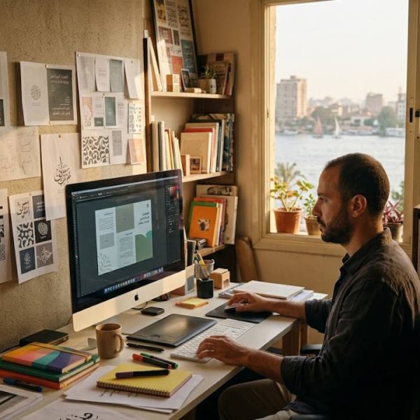
A company finishes the Arabic translation of its product brochure, sends it to the designer and waits for the final PDF. What comes back is a layout where sentences run in the wrong direction, numbers jump around, punctuation sits at the start of lines and some letters appear disconnected. The translation was correct. The layout was not.
This is a familiar story for anyone who has localised content into Arabic, Hebrew, Persian or Urdu. Right-to-left languages require more than translation. They require desktop publishing that understands how these scripts work.
How right-to-left scripts work
Arabic is written from right to left, and its letters change shape depending on whether they appear at the start, middle or end of a word, or stand alone. Numbers, however, are usually read left to right, and English brand names or codes inside Arabic text also run left to right. Software handles this mix through the bidirectional algorithm defined by the Unicode Consortium, which sets the rules for displaying text that combines both directions.
When design software does not support these rules properly, a perfect translation can turn into an unreadable page.
Mirroring the whole layout
A right-to-left document is not just a left-to-right document with different text. The whole page is usually mirrored. Navigation, tables, charts, timelines and image placement move to the opposite side. The cover of a brochure opens from what a European reader would consider the back. Arrows that point forward should point left. Even icons with a sense of direction, such as a play button or a progress bar, may need reconsideration.
- Text alignment and paragraph direction set to right-to-left
- Columns, tables and charts mirrored where it makes sense
- Page order and binding reversed for printed material
- Directional icons and arrows checked and adapted
- Logos and product photos kept unmirrored
Fonts matter more than you think
Many Latin fonts include no Arabic characters at all, and the fallback font chosen by the software may clash with the brand design. A good Arabic typeface supports all letter forms, diacritics and ligatures, and matches the tone of the brand, whether modern and clean or traditional and elegant. Line spacing often needs to increase, because Arabic letters have taller ascenders and deeper descenders than Latin script.
Numbers, dates and units
Arabic-speaking countries use both Western digits and Eastern Arabic numerals, depending on the country and the context. Egypt and the Gulf states often use Eastern Arabic numerals in traditional media, while technical documents and websites frequently use Western digits. Dates, currencies and units must also follow local conventions. These choices should be agreed with the client at the start of the project.
Mixed content and brand names
Product names, model numbers, email addresses and URLs often stay in Latin script inside Arabic sentences. Without careful handling, they can appear in the wrong position or flip parts of the sentence around them. Experienced DTP specialists test these mixed lines carefully and correct the direction markers where needed.
Translation and layout as one workflow
The best results come when translation and desktop publishing are planned together. Translators deliver text that fits the space available, DTP specialists flag lines that are too long, and a final linguistic check is done on the finished layout, not just on the text file. This last step catches broken words, missing diacritics and misplaced punctuation that only become visible on the page.
Language partners offering professional translation services together with multilingual desktop publishing, such as PoliLingua, can manage the whole chain, from Arabic translation by native linguists to print-ready files and a final review in context.
Hospitals and clinics face the same layout challenge when they publish Arabic patient leaflets, consent forms and discharge instructions. Teams comparing medical translation services should check that the provider also reviews the finished right-to-left layout, not only the translated text. A mirrored page that a native reviewer has checked prevents confusion about medication times and follow-up steps. For patients, that final check can be the difference between a leaflet that sits unread and one that genuinely guides their recovery.
London clinics serving Arabic-speaking patients face a similar mix of translation and layout work when their intake forms and aftercare notes move between languages. Clinics that arrange certified translation services for those documents can keep terminology consistent from the first appointment to discharge. That consistency also helps front-desk teams file records correctly and answer patient questions without guesswork. In a multilingual city, it turns paperwork from a recurring obstacle into part of the care itself.
Websites and apps
Online, the same principles apply. Websites need right-to-left style sheets, mirrored navigation and forms that accept Arabic input correctly. Apps must handle text direction in every screen, including error messages and notifications. Search functions should work with Arabic characters and their variants. Testing on real devices with Arabic-speaking users reveals problems that automated checks miss.
Common mistakes
- Pasting Arabic text into software without right-to-left support
- Using a Latin font without Arabic glyphs
- Forgetting to mirror charts and tables
- Skipping a final review of the layout by a native speaker
- Shrinking font size to fit text instead of adjusting the design
Other right-to-left languages
Hebrew, Persian and Urdu share many of these challenges, though each has its own script features. Urdu, for example, is usually set in Nastaliq style, which has a slanted, flowing look and needs more vertical space. Persian uses some additional letters and its own numerals. A DTP team experienced with one right-to-left language is a good start, but native review remains essential for each.
Planning a project
Share editable source files, such as InDesign packages with fonts and images, rather than PDFs. Define the target countries, numeral style and any brand guidelines for Arabic. Allow extra time for layout and review compared with left-to-right languages. These steps keep the project on schedule and the result professional.
The bottom line
Arabic speakers make up a huge market across the Middle East and North Africa. To reach them with confidence, combine accurate translation with expert right-to-left desktop publishing. The result is material that looks as natural to an Arabic reader as the original does to its first audience.
Hospitals and clinics face the same layout challenge when they publish Arabic patient leaflets, consent forms and discharge instructions. Teams comparing medical translation services should check that the provider also reviews the finished right- to-left layout, not only the translated text. A mirrored page that a native reviewer has checked prevents confusion about medication times and follow-up steps. For patients, that final check can be the difference between a leaflet that sits unread and one that genuinely guides their recovery.